Canyon Cultivation
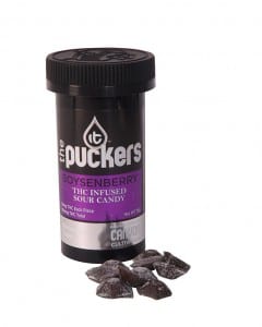
Canyon Cultivation, a Colorado-based cannabis products manufacturer, retained TGA in 2014 to rebrand its vast product line and corporate identity. The legal marijuana business in Colorado is a new and fast growing industry. Our immediate goal was to quickly differentiate Canyon and the “IT” brand from the other edibles producers in the state. Canyon is currently the only edibles company that uses an organic extraction process, removing the hash oil from the marijuana plant. The IT product line features a variety of edibles, all made with organic and/or natural ingredients. Canyon touts superior quality and consistency in its products. The brand, product line and website were designed to reflect a high-end product that appeals to a broader adult (21 and over) audience.
Website
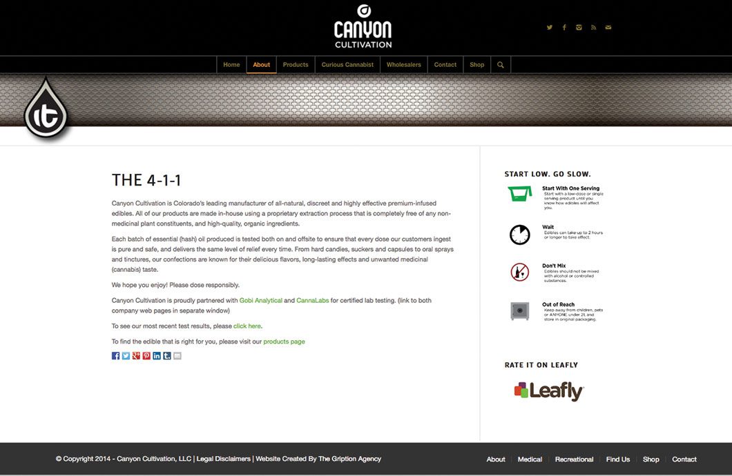
A fun and fact-filled website was designed to enhance the brand and support the relaunch of the popular IT brand products. The site includes a retail location finder tool, social media “mash-up” lounge featuring Twitter, Facebook, and Instagram feeds, and many other cutting-edge features, stylish graphics and brand-specific design elements.
Logos
The Canyon Cultivation logo represents the true nature of the business, which is the proprietary essential oil extraction method Canyon uses to manufacture its product line.
The IT brand logo ties into the parent brand, focusing on the oil aspect of the products, not the cliche marijuana plant that is broadly used by nearly every other cannabis business.
Product Packaging
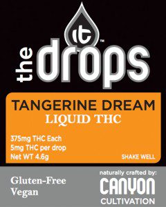
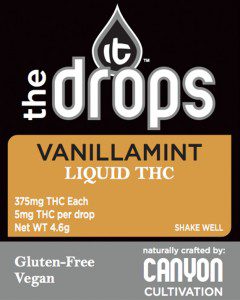
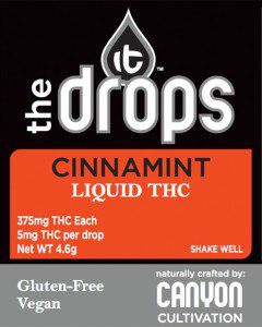
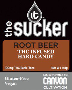
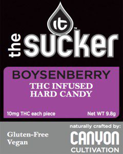
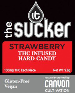
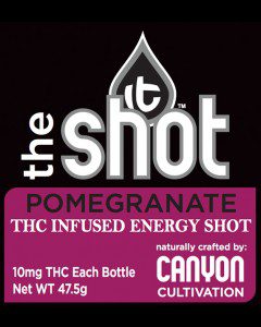
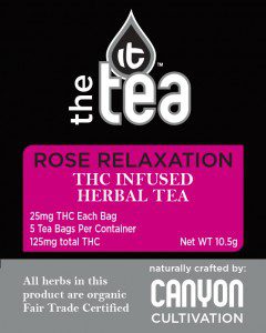
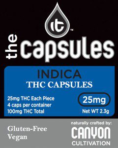
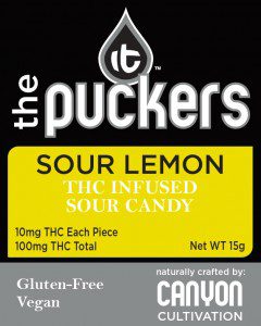
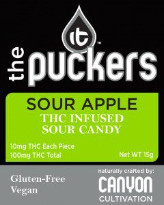
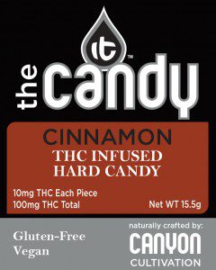
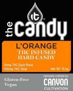
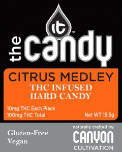
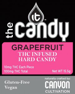
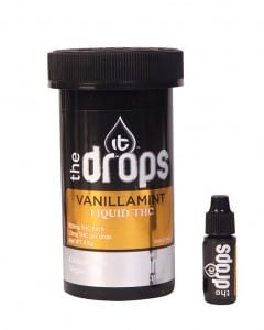
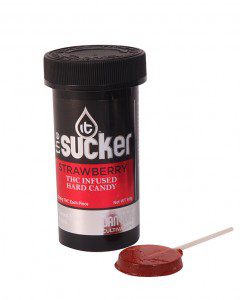
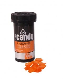
Operating a legal cannabis edibles business in Colorado requires steadfast adherence to constantly evolving legal requirements. Both medical and recreational products must follow strict, but different, guidelines when it comes to product packaging. TGA successfully relaunched stunning new packaging that will comply with current and anticipated changes in the regulations. The flexible design allows our client to move quickly in the market as things change from month to month.
Point of Sale
The IT brand POS display for retail outlets and medical dispensaries is designed to tie into the new branding and product packaging. It is also meant to be a versatile tool, to easily interchange product cards as the line evolves.
Advertising
A full page print ad for the 2014 holiday season helped Canyon Cultivation launch a new product, an infused energy drink shot. The design of the ad leverages the new look packaging and branding.
Business Cards, Order Forms and Stationary
Essential business elements were included in the rebranding project for Canyon Cultivation. These elements carry over the brand theme as well as tie into the popular IT product line to help with the introduction of the new look and feel among commercial accounts and consumers.
